
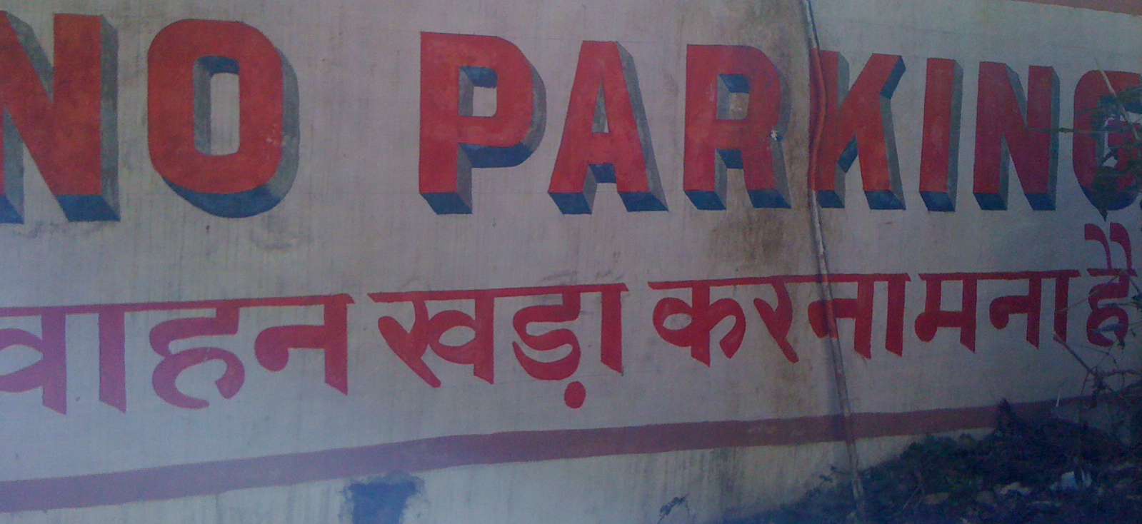
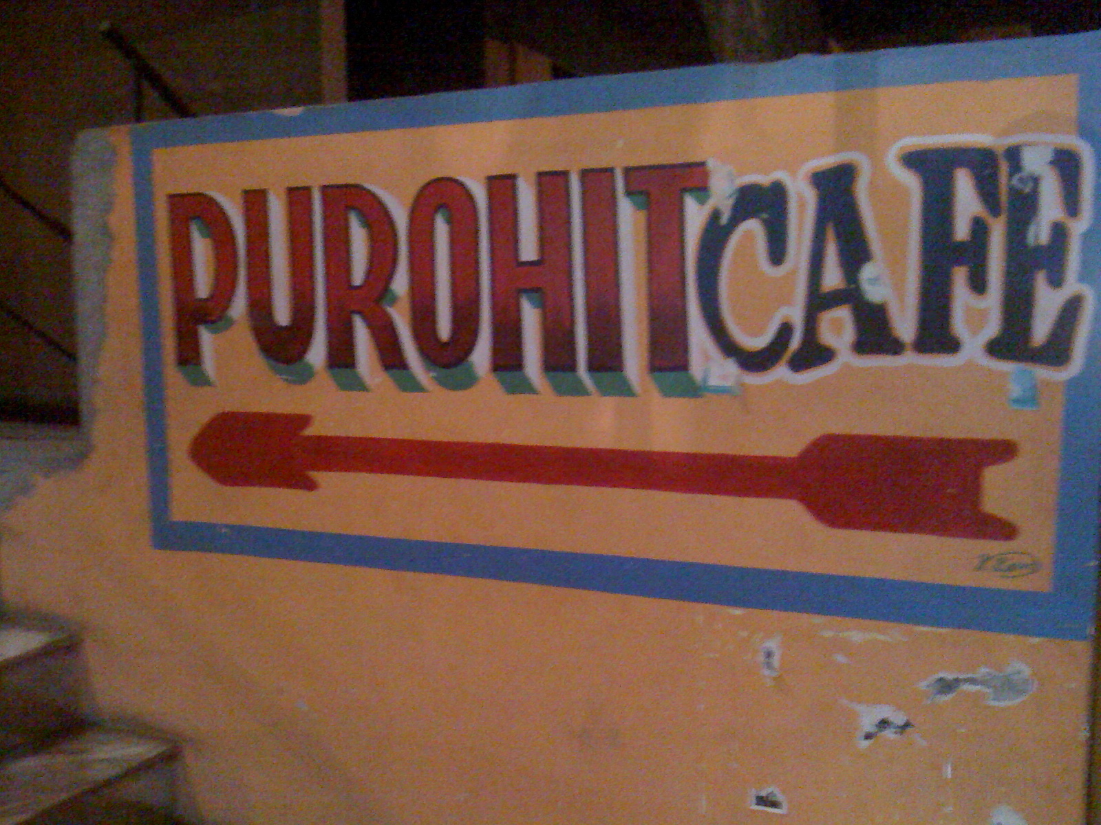
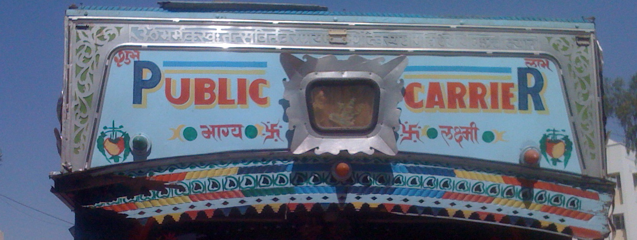
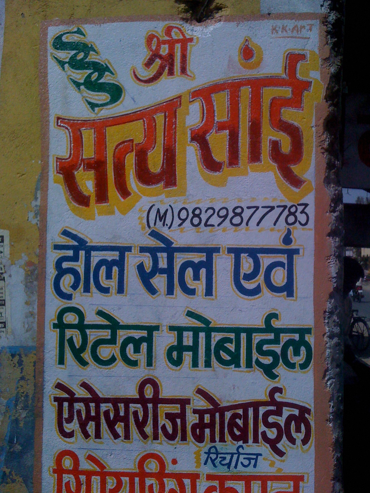
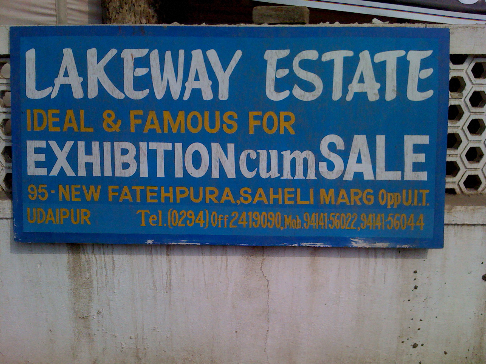
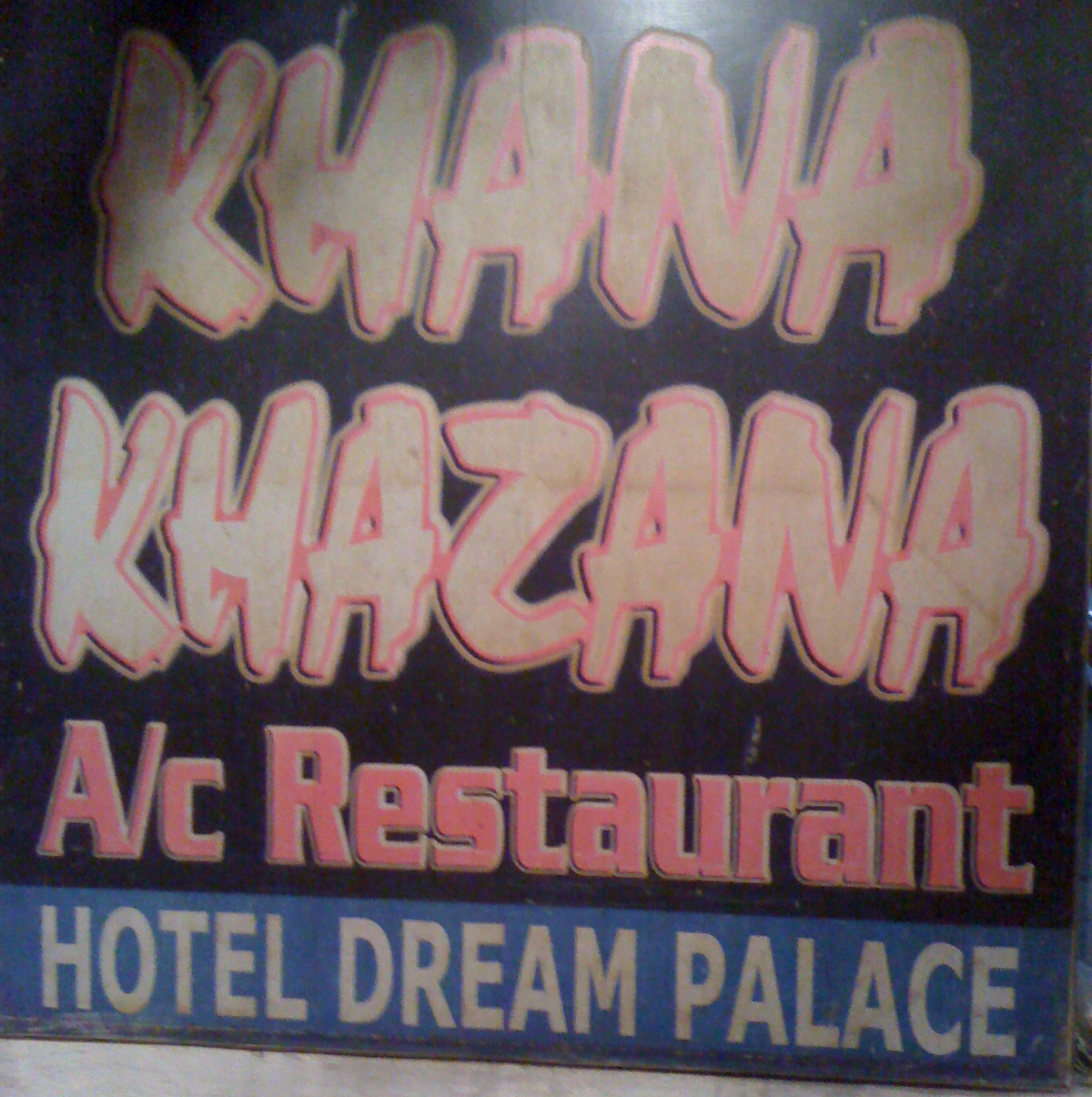
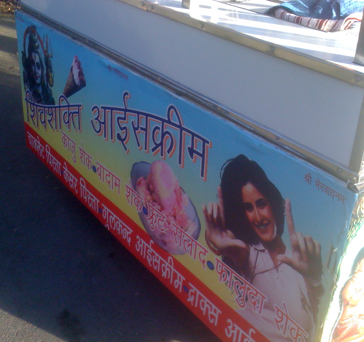
The painted typography here is beautiful. A large percentage of the hand-painted signs have excellent fonts and cool drop shadows or borders. Here are some examples:

As good as the painted signs are, the computerized/printed signs are bad. There’s a limited font range and the colors are just uglier.
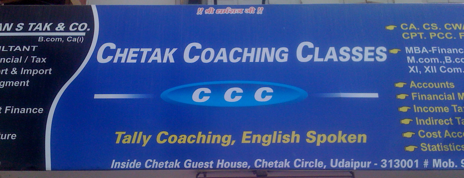
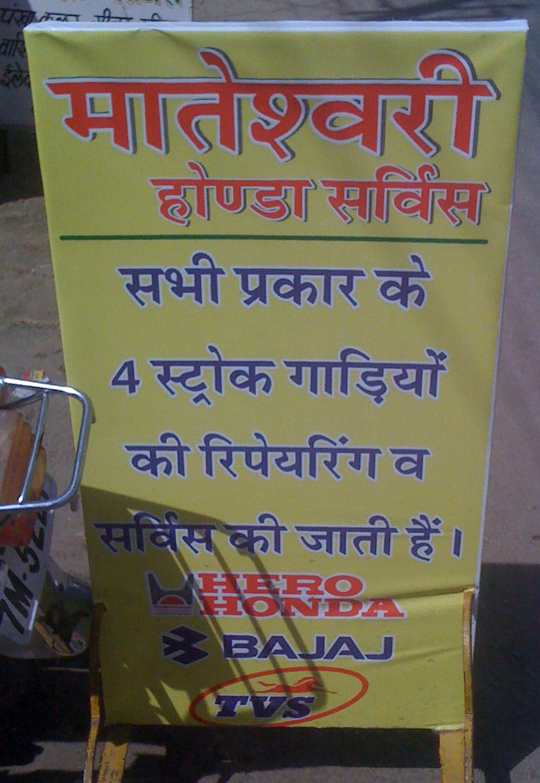
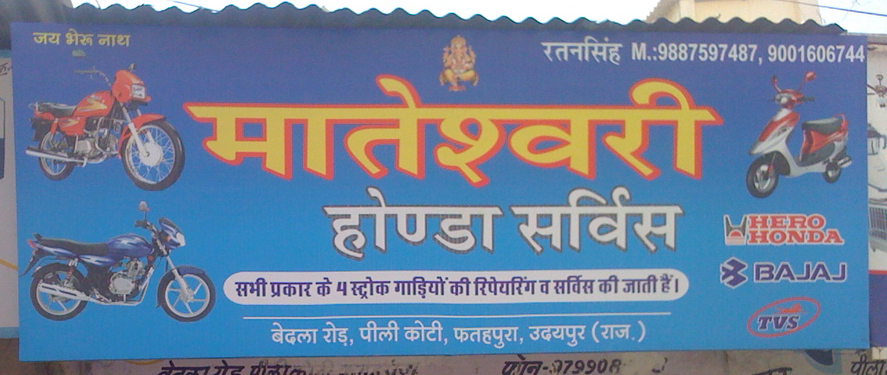
I’ll accept that for the target audience, the signal might be different: a printed sign might indicate prosperity or technological sophistication. But it’s a shame because the hand-painted ones are so pretty.
Liked what you read? I am available for hire.
Comments are heavily moderated.